

The Body Shop
The Body shop, founded in 1976, currently has a range of 1,000 products sold in about 3000 stores in 65 countries. They believe to exist to fight for what is good, and just, and beautiful. The company sells cosmetic products with natural raw ingredients. The Body shop has the most wonderful way of delivering high performing efficacious skincare. The company focuses on products like shampoo, conditioners, bath products, soaps, face and body creams, fragrances, spa products, and natural beauty products created while causing minimal harm to the environment.

Why Redesign?
During COVID, mindless scrolling through online shopping apps and website, I once stumbled on the body shop’s website. After using the website, I felt that some of user interaction in the website and UI elements can be designed better. I faced some trouble navigating through it and finding relevant stuff. The categorisation of products could have been a little easier to make. seamless process for a user. So I decided to look deeper in the website and research a little more about it from the other users.
I do not work for The Body shop, and the views in the redesign are strictly my own on the basis of research from multiple reviews from the users of body shop.
My personal objective from this project was to attract UI/UX opportunities and to build my portfolio. This redesign project was purposeful because it had both personal and design objective.
Duration: September 2021
Role: UX research, UI Design, Interaction Design.
I was involved in every aspect of the process from research to analysis and design.
Methods & Tools: Figma, Google forms, Pen and Paper
Qualitative interviews, Surveys, tree testing, User testing, User persona, Problem Statement, User flow, Design System, Wireframing, Prototyping
User research
Before diving into the design process, I wanted to cross check my assumptions about the website. I read online reviews to get an idea of other user’s view points. To my surprise, people were facing the issues with the website.
To further have a clear understanding of the issues, it was necessary to analyse who are the target audience of their product. To do this I conducted ten online video interviews.
I asked general questions like:
-
Where do you buy most of your skincare products from?
-
Do you do online shopping?
-
If yes then what do you think about it? etc etc
My subjects were people aged 19-50,
-
A college student who is fluent with e-commerce websites and shops quite often
-
A housewife who likes shopping but lacks confidence for online shopping. sometimes can’t find products she needs online ,so prefers to buy them from stores.
-
I observed people using the website. I identified few common issues each user went through. This qualitative research helped me understand the user needs and their problems a little better.
Insights
-
Users get overwhelmed by the information, not organised clearly.
-
Navigation problem
-
Confusion on the information provided for the ‘offers’.
-
Categorisation of products in the menu, made products hard to find.
-
Basic products hidden in the complicated categories.
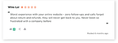
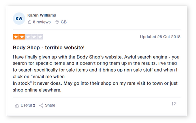
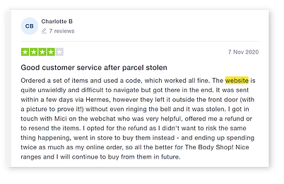
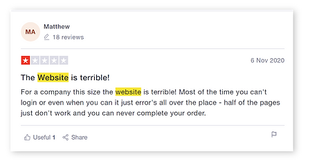
Customer Reviews about website
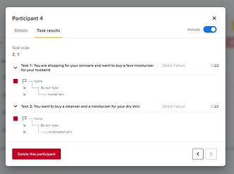
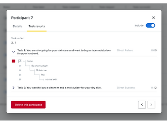
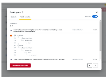
Tree testing of Current Navigation:
I conducted online tree testing with 10-11 participants to test the current navigation menu of the body shop website. The results suggested that the users faced problems locating the mEn skincare products and were confused with the category ‘Grooming’.

Tree testing
The solution:
-
To deliver a seamless experience and intuitive user interface.
-
To make discoverability of items easier for user to search on the basis of what they want.
-
Emphasise and work more on visual identity, an improved user experience of the core pages.
IDEATION:
With that design objective, I redesigned some of the core pages in the website. Keeping those insights in mind, I kept the pages spaced out and visually appealing while maintaining their brand image.
Sketches:
I created some initial sketches to focus on the key functions to be included in the design and also to help me focus on the features to add in the website.


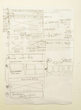
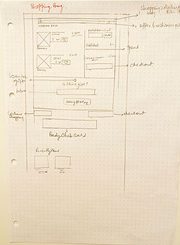
Paper wireframes
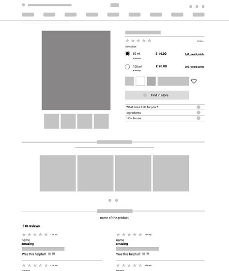
Wireframes/ Low Fidelity
After the sketches, I created some more refined digital wireframes with little interactions and navigational possibilities for more accuracy, precision and details.

Cart

Search
Product page
%20wireframe.jpg)
High Fidelity
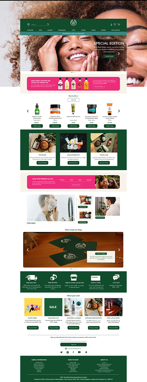
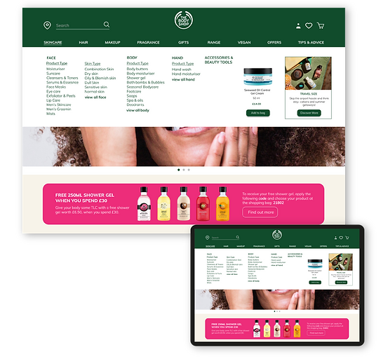
Homepage:
To make homepage simple and user friendly, I divided the screen into several boxes. Using Box layout, I presented group of products in categories, which are easily visible and doesn’t let the user guess or think about the navigational category.I ensured that navigational scheme is simple by keeping minimal necessary options.
-
Clear banner for offers
-
A list of bestseller products in a carousel
-
To buy vegan products users had to go deeper in the website to buy it. I added vegan products on the page as it informs user of it's availability.
-
A section for male skincare products and tools on homepage. I found out from the interviews that many users were confused whether body shop is a place for men skincare. I highlighted men skincare on homepage to inform users about men skincare products availability.
-
Keeping all the insights in mind, I tried to bring all the customer service together in one box layout. It makes it easier for user to look for any help when needed.
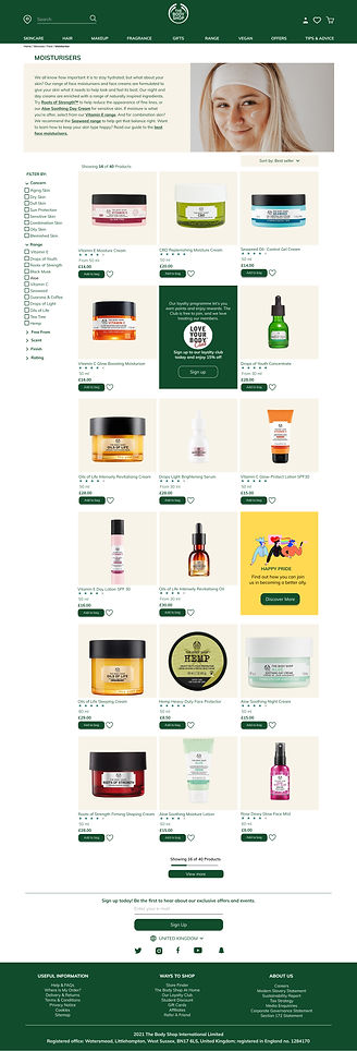
Search page
-
A lot of users prefer to see their last searches, if they want to go back to it anytime later. I made it one click away for them.

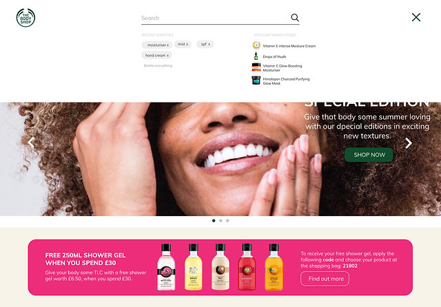
-
an option to give to users to see the matching products to their searches, sometimes users find their products from these options. Any popular or trending product.

-
A clean and clear categorised group of filters. easy to understand for the users.
-
Navigation category in the menu consists of Skincare, Hair, Makeup, Fragrance, Gifts, Range, Vegan, Offers and Tips & Advice. After a lot of research I concluded that these are the primary menu options which should be in the navigational menus. These are most visited by users hence why placed them on the bar. The body shop's website lacked these menus which resulted in frustrated customers.
Navigation
.jpg)
Search Results
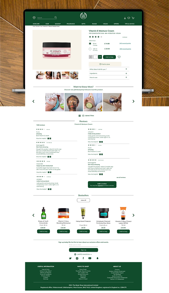
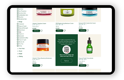
Products Page
-
I have kept product page easy to scan, with the adequate information required to look at before buying the product.
-
Information such as, quantity, reviews from the buyers, prize for different sizes, reward points, an option to check the stock in store.
-
To save products in favourites.
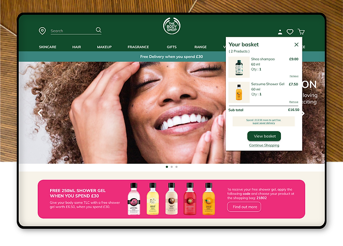
Cart
Tree testing
TAKEAWAY:
-
The design process can be never ending, what matters is the priority of user needs
-
I got an idea on some of the constraints users do encounter when looking to buy something online.
-
this project helped me to see and revalidate my understanding that good approach towards the user's needs can not only help users but can bring good to the brand as well.