
"memories to be made and dreams to come true"
INTRODUCTION
Finding and moving house is not something easy, it can be stressful.
Listening from friends and family, I am familiar with the struggle of finding an apartment, The multiple tours of countless apartments to packing and moving all your stuff. It is not the only hard work, you then have to face with familiarising yourself with the locality around, new neighbourhood.
To make it a hassle free process, I created Homely which is an online apartment finding responsive website that caters housing needs for families, bachelors and provides same service to students as well.
It provides full furnished/semi furnished/ unfurnished well maintained flats.
This case study descries my process of creating Homely, a responsive website for finding apartments in London.
Duration: June 2022
Role: UX research, UI Design, Interaction Design.
I was involved in every aspect of the process from research to analysis and design.
Methods & Tools: Adobe XD, Miro, Google forms, Pen and Paper
Qualitative interviews, Site map, User testing, User persona, Problem Statement, User flow, Design System, Wireframing, Prototyping


The problem:
It is often difficult to find properties which suits your situation better. Budget, decision making, countless tours can lead to stress and at times make it emotionally frustrating. One of the serious problem people encounter is lack of proper information of the property they are looking which leads to trust issues.
It is very important to know everything about the big investment you are going to do.
The solution:
Make a website which allows people to look for properties with the adequate information. Also allows the user to search for their future house as seamless and stress free as possible while improving and introducing other factors.

EMPATHISING WITH USER
To start with my project I wanted some key findings and insights to form a perspective. So I crafted some questions to reflect the information I needed to gain an understanding of how people find accommodation and the problems they face during this process. I decided to have a conversation with few friends and family members to know their personal experiences and asked them to later forward the survey questions to other people they know.
Below are the follow findings from the research:
-
Usually people look for new accommodations because of education or job relocations, to decrease their commute and find places nearby to live.
-
People need an easy way to search for properties, with basic filters such as price, size, location etc.
-
Users could live alone, or with families hence why look for adequate information about the property. Location specification is a must for users.
-
Users want to look at properties at their convenience, easily book meetings with their viewers and brokerage.
-
Users don’t know much about the whole process of investing in property.
-
Users who are students need to find affordable places to stay, with basic amenities like storage, furnishing etc. They want the information about locality, how well connected it is, does it have accessible modes of commute, food joints. which becomes a problem of affordability.
-
People prefer to know all the cost upfront. No hidden cost.
-
Sometimes pictures are deceiving. Sometimes property looks nothing like the picture in reality.
Persona:
Below is the persona which represents our target user, people designed to reflect the characteristics taken from real data. Referring back to the personas’ during the whole design process helps to design based on the user needs.
“ It’s hard to visualise with the pictures provided.”

Age - 25
Education - Computer engineer
Job - DevOps engineer
Frustrations:
-
No proper information about the locality, new neighbourhood.
-
First investment so know nothing about the process.
Goal:
-
Provide information about nearby establishments, travel routes, food etc through a map.
-
To read blogs on the website for help with knowledge about investing process.
Problem statement:
'Akhil is an engineer and young investor who needs to easily find information about the nearby establishments, 360 view because he wants to invest good and have an option to virtually visit before finalising anything.'
IDEATION AND WIREFRAMES
Sketching & Paper wireframes
I sketched out paper wireframes, keeping the findings and user pain points in mind. I had a good idea of how and what to organise in the website.
I started looking into the competitors websites as well, this helped to form the foundation for my next steps.


Digital Wireframes/ Low Fidelity
Before making a mockup, I made a wireframe first to get an idea of the basic outline of the design that I would be working on. created the first important pages for the website like, Landing page(homepage), the search result page for the property, the property page. I later refined my mockups with buttons, more classified filter options, dashboard, important elements in the website like forms for booking the viewing etc.
Desktop- Digital wireframes

Home page

Search results
Property Page


Digital Wireframes for Desktop

Low Fidelity Prototyping
Mobile- Digital wireframes

Home page

Search result page
SITE MAP
The structure I chose for the site map was designed to make navigations flow simple and easy. I didn't make it complicated with the words which could make users feel overwhelmed.


STYLE GUIDE


High Fidelity
to see high fidelity prototyping
Home page
-
'Check out new property'
Some of the users who usually don't directly search for the property and checkout the website first usually gets attracted to something which is already ready for them without their searching or doing anything.
-
'Moving stories, Property guides, Housing trends, Housing News' to keep the users updated.
The very important reason to have it on the homepage is to attract the first time buyers who have no knowledge about the process. And help them get the required guidance.
-
'Reviews' keeping all the insights and user pain points in mind, I concluded that it would be better to add an option to see reviews of your neighbourhood.
This is an option for all the viewers, landing on the website to take a minute and add review of their current neighbourhood.
User views can be moderated with other data bases like government published crime rate data, other proved and unbiased surveys.
-
'Student accommodation', a very important finding identified from the surveys, often times students have to dig deeper in the website to look for the suitable accommodation for them. I concluded to put an element of attraction for the students, which can help their process of finding apartment seamless.
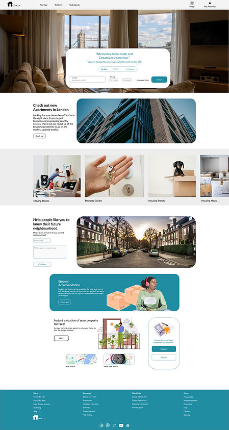
Travel time search page

-
'Travel time search' during the qualitative research, I found out that a lot of people consider travel time as an essential factor when buying a house. An option on the homepage can let users know that they have an option to go for travel time search.
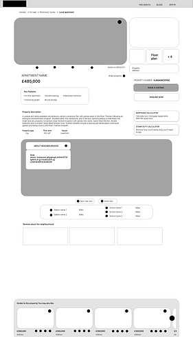
Property page
-
Listing history
Property description
Key features
Property type
All the above features to help users get adequate information about the property to help them trust the site and brokers.
-
'Similar to this property' to give users range of options in the same preferred filters. To cut one step of going back and searching again, users can rather go through the customised options of similar properties provided.

-
option to save the properties in favourites to help users organise their interests.
-
'About neighbourhood' A brief note about the locality of the property, the nearest parks, train stations, restaurants.
-
And a map, for a clearer view of the neighbourhood.
-
Nearby schools and stations.
-
'Reviews', all the collected reviews from the home page will be filtered and categorised to be shown on the same locality properties.
This will help people know the neighbourhood they are buying in and make their decision making easier.
Property page in more depth
Book a viewing
Enquire Now
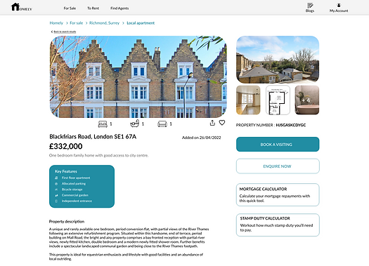


-
'Book a viewing' and 'Enquire Now' let do a quick booking for a viewing, could be virtual or in person. 2 steps and 2-3 inputs to fill, selecting available date and time will let users will organised for their viewing.
-
'Mortgage calculator' and 'stamp duty calculator', makes it easier for the user to quickly calculate the required while checking out the property. it saves time and let user be aware of upcoming expense, if going forward with the property.
Mortgage calculator
Stamp duty calculator


More Screens- Mobile
More pages

Sign in
Search results

Property page
-
Listing history
Property description
Key features
Property type
All the above features to help users get adequate information about the property to help them trust the site and brokers.
-
'Similar to this property' to give users range of options in the same preferred filters. To cut one step of going back and searching again, users can rather go through the customised options of similar properties provided.
-
option to save the properties in favourites to help users organise their interests.
-
'About neighbourhood' A brief note about the locality of the property, the nearest parks, train stations, restaurants.
-
And a map, for a clearer view of the neighbourhood.
-
Nearby schools and stations.
-
'Reviews', all the collected reviews from the home page will be filtered and categorised to be shown on the same locality properties.
This will help people know the neighbourhood they are buying in and make their decision making easier.
Property page in more depth
Book a viewing
Enquire Now
Mortgage calculator
Stamp duty calculator
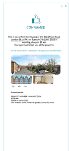
Viewing confirmation
-
'Book a viewing' and 'Enquire Now' let do a quick booking for a viewing, could be virtual or in person. 2 steps and 2-3 inputs to fill, selecting available date and time will let users will organised for their viewing.
-
'Mortgage calculator' and 'stamp duty calculator', makes it easier for the user to quickly calculate the required while checking out the property. it saves time and let user be aware of upcoming expense, if going forward with the property.
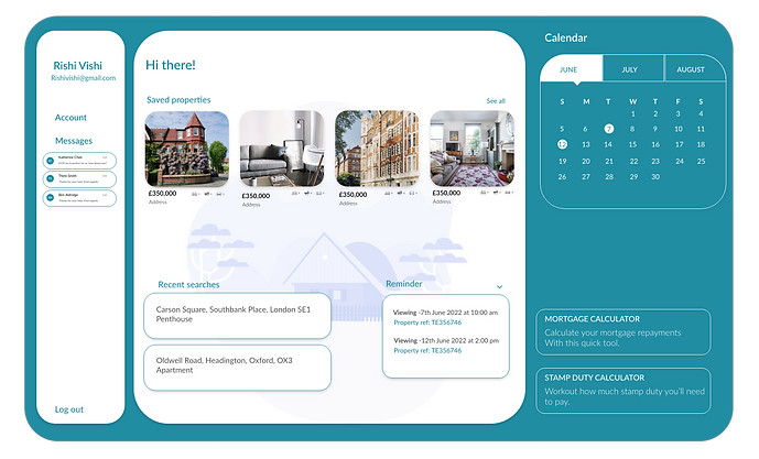
Dashboard/My Account
-
'Saved properties', to show all the shortlisted properties of the user.
-
'Calendar', to show the upcoming meetings or a reminder to users about their viewing.
-
'Messages, all the messages, enquires sent by the user.
-
'Recent searches', to save all the searches made by the use, for an easy and quick access next time searching.

TAKEAWAY
-
I learnt how to conduct qualitative research, art of framing questions.
-
An understanding of how to structure and present data in amore effective way.
-
Make design changes that would elevate trust and make the process stress free.
-
Really empathising with the user and designing for them can have a huge impact on the user experience.
-
It is very important to focus on the real needs of the user when coming up with design ideas and solutions.
ACCESSIBILITY CONSIDERATIONS
-
I used icons paired with labels fro clear understanding
-
I used different text sizes, so users can scan the site easily.
Thank you for reading this case study.